COMPANY PROFILE
Wilmington University is one of the fastest growing private non-profit institutions in higher education, rapid growth isn't new for the organization though. Over the past seven years the university has doubled its enrollment from 10,000 to over 20,000 students..
Fast Facts
20K+
Students
14
Campuses
1.6M
Avg. Website Visits / Month
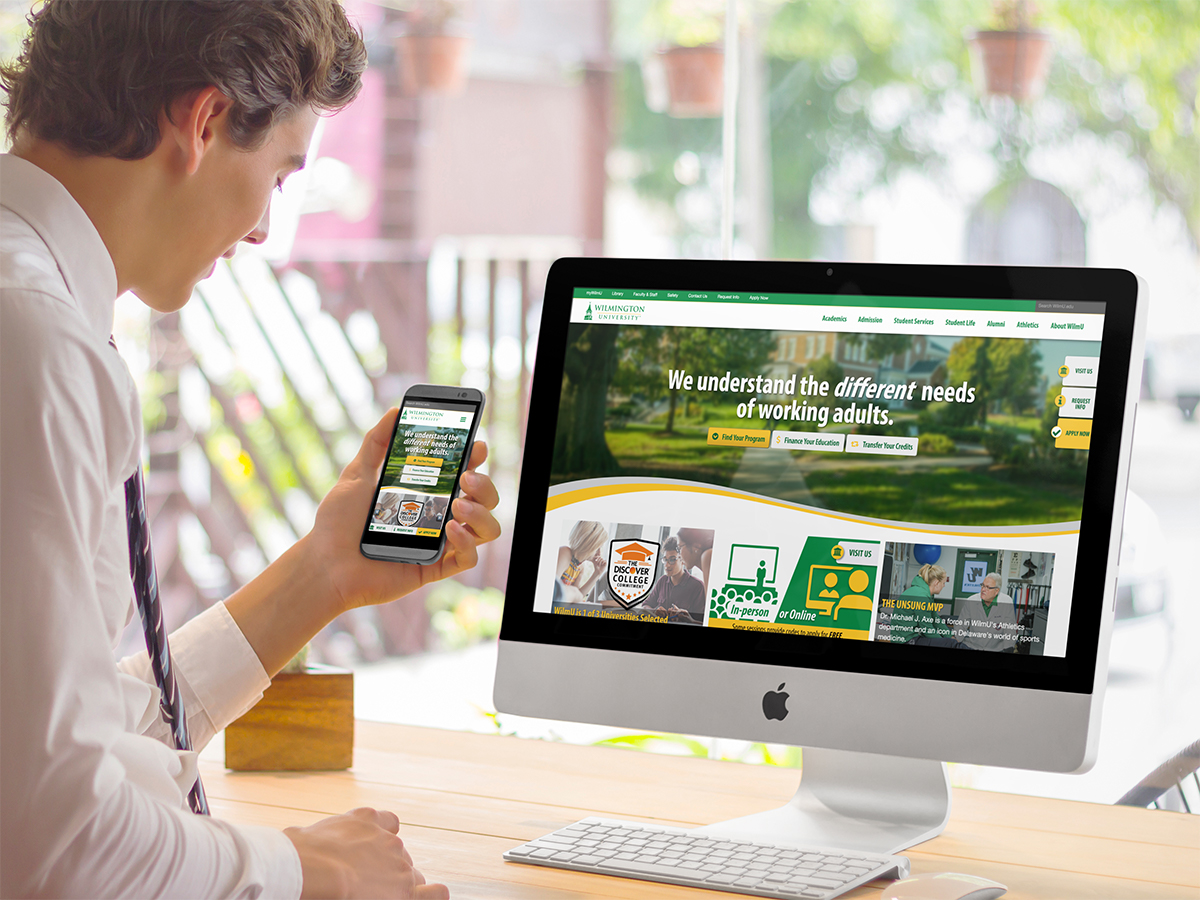
2018 Homepage Optmization & Visual Refresh
In 2018 a revamped visual design was implemented across wilmu.edu, but more significantly, a complete overhaul of the university’s homepage was launched. Three key goals were identified for the homepage:
- Bring focus to prospective student calls to action.
- Improve the discovery and presentation of the university’s products and services (degrees and unique differentiators)
- Effectively tell the WilmU story.
The UX Process
1. Gather Customer Data and Develop Personas
I worked closely with the analyst on my team to gather user data points from various sources with the goal of building user personas. Being part of an internal team, people are familiar with the makeup of our customers, however, the communicate their traits in a narrative, tangible way — this is how we would be empathy and understanding across the organization. These personas served as an anchor when tangential discussions in meetings would occur, proving to be more valuable than we could have imagined. They were used not only to keep designers and developers focused on the task at hand but also executives and important stakeholders.
2. Form Taskforce and Create Design Brief
Speaking of stakeholders, it was time to form an all-star group of people from around the university to collaborate and drive this project. The benefit of working on an internal team is that you know almost inherently who the big decision makers are. Two groups were formed: the “big” group, consisting of a few integral executives, a small cross-discipline team, and a handful of service area members. The second “small” group consistent of just the cross-discipline team. The small group was made up of digital designers/developers from the Web Team, graphic designers and copywriters from marketing, and analysts.
The small group met first to conduct competitor analysis, flesh out a design brief, and properly scope the project, breaking it down into small chunks.
3. Organize and Conduct Design Studio Collaboration
Next, we had an “all-hands-on-deck” collaboration session called a “Design Studio”. I learned about this method from Jared Spool of UIE and the conferences he organizes. Essentially, it’s an all-day sprint where non-designers and designers work together to brainstorm solutions to problems and create MVPs(minimum viable products). I share the belief that anyone who has influence over a project is a designer, the design process doesn’t have to be pretty, you don’t have to know how to sketch beautiful UIs, anyone can do it with a little training.
4. In this design studio, we tackled the three problems identified earlier:
- Bring focus to prospective student calls to action.
- Improve the discovery and presentation of the university’s products and services (degrees and unique differentiators)
- Effectively tell the WilmU story.
Participants were provided with personas and divided into small groups to tackle one of their problems above. Again, I used moderation techniques I learned from the UI22 conference (Jared Spool) to avoid issues like group-think, confirmation bias, and wasting valuable time.
Everyone from a C-level executive, to copywriters, and graphic designers sketched and critiqued, argued, and debated. I didn’t expect the groups to solve every single problem (or even one if I’m being honest) but the outcome was even better than I could have imagined. The design studio created a sense of ownership across business units, made people feel like they’re part of the process, and demystified design and digital experiences. At the end, we were able to leverage some really good ideas and incorporate them into a prototype.
5. Distill Outcomes from Design Studio into Concept Prototypes
The team was really impressed with the creativity and collaboration of the group during the design studio. We distilled the exercise into 3 or 4 approaches to solve problems. Interestingly enough, I mixed and matched ideas from the different groups for various components. Using Adobe XD for the first time, I developed a clickable prototype to share with the small workgroup. We kicked the tires on it during a working meeting and made improvements on the fly. At this point we were ready to start testing our hypotheses with real people.
6. Usability Testing (in-house and external)
Before setting testers loose on the MVP, it had to be crystal clear what we were testing for. How would we evaluate the performance of the prototype? We came up with a list of tasks that demonstrated a user’s fluency of the three 3 key goals we had for the homepage. Once the test script was finalized, we recruited users to do a combination of in-house, moderated testing and remote, unmoderated testing.
Results from user testing are always uncomfortable and insightful. Even if everything goes to plan, there’s always that one person that makes you say in your head, “Wait, wait, don’t do that!”.
7. Iterate Homepage Prototype Based on Test Insights
The results showed we were on the right track and only had to make a few tweaks to the user interface to make some components more obviously interactive, encourage scrolling more, and reduce visual noise.
8. Configure Analytics and Dashboards to Measure KPIs
The web analyst on the team developed dashboards that allowed us to easily share performance of the homepage to executives and stakeholders across the university. A performance dashboard that effectively communicates the performance of key interactions and behaviors in a simple way is critical.
9. Present to Executive Team (VPs & President)
I was asked to present the results of this project to the executive cabinet of the university, it had to short, clear, and to the point. Honestly, although there were a few familiar faces and I had done this type of presentation before, IT’S NEVER EASY. I learned I would be presenting to the group right before their lunch arrived, so that there’s nothing like talking in front of a group of ravenous execs, right?!
The presentation went way smoother than I could have dreamed. There were some great questions from a few of the VPs and the president had very positive reactions to not only the finished product but the process. We got the green light to proceed with the final stages and launch.
10. Launch
The last stage of the production process was to refactor the code and continue testing across various browsers, devices, and resolutions. I used the CSS preprocessor, SCSS for the first time in production on this project. It really helped to operationalize and systematize branding elements like color, typeography, as well as UI components. The website’s design system, by the end of this whole thing, was really rebuilt from the ground up.
Four of us from the Web Team stayed late one night and pushed out all of the code, uncached the servers, and made a few last minute adjustments to improve performance.
The Surprising Results
- Bounce Rate: Reduced from ~50% to ~11%
- Exit Rate: Reduced from ~38% to %12%
- Time on Page: Reduced from 1:47 to 0:45
- Increased Sessions on All High Value Landing Pages
WilmU Locations Discovery Redesign
The university needed a rethink of the campus and locations discovery experience for prospective and current students. The initiative was driven by feedback from current students, a marketing campaign promoting satelite locations in New Jersey and southern Delaware, and providing an entry point to the website that was responsive and welcoming.
View ProjectRequirements
- Mobile-first Responsive Page
- Quick access to campus-specific contact information
- Communicate diverse location offerings across region
- Easily Navigate Campus Landing Pages
- Use Google Maps in lieu of home grown directions solution
Technology
This page uses one of several responsive templates I developed as part of a larger responsive overhaul—leveraging Bootstrap's grid system and customized user interface elements. Using the AngularJS framework in conjunction with JSON data. a one page application that filters campuses by state, reduces HTML markup with the use of the ng-repeat templating model, and loads content on demand.
HTML5
CSS3
jQuery
AngularJS
JSON
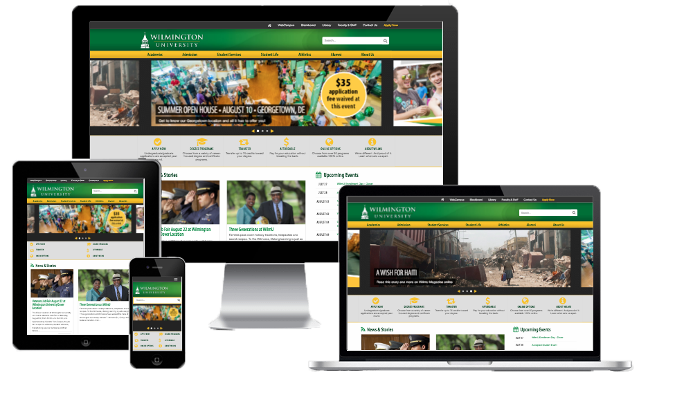
WilmU.edu First Responsive Redesign
By the time 2013 rolled around it was clear the dedicated mobile website wasn’t cutting it for visitors, they were bypassing it to reach the full website— a consistent experience for all devices was needed. The project spanned the course of just under a year, which included planning, collaboration with the marketing team and stakeholders, conducting user tests, quality assurance, production and go-live.
(Website has since been updated)
Role
- Project Lead
- Design Lead
- Production Lead
- Co-Researcher
Technology
Templates design and developed for this project used Boostrap's grid system, customized buttons, interactive elements (sliders, popups, etc.), and other user interface elements. Custom media queries were developed based on user device demographics from Google Analytics, and CSS3 transitions were used to progressively enhance UI elements.
HTML5
CSS3
jQuery
Online Learning Redesign
Promoting Wilmington University's Online offerings is an institutional priority. The 100% Online format has experienced tremendous growth and is one of the contributing factors for overall gains in enrollment.
Simply put, the previous web presence for Online Learning was not optimized for converting visitors into leads.
The redesign resulting in cutting the bounce-rate for mobile users by 70% and increased time on page. This aligned with the department's goals of informing prospects of online offerings and capabilities as well as providing a pleasurable digital experience to mobile users.
view ProjectRole
- Project Lead
- Design Lead
- Production
- Researcher
Technology
Google Analytics, UserTesting.com, stakeholder interviews, and user interviews informed many of hte design decisions that went into this project.
The team used Google's model for rapidly brainstorming, prototyping and testing digital experiences also know as a "Design Sprint". We were able to build upon years of internal and external research to create user personas, Online-specific customer journey maps, and a heuristic framework for user tasks. Design thinking is really what drives this process. It turned out to be extremely enlightening both for the design and development team and the stakeholders alike.
HTML5
CSS3
jQuery
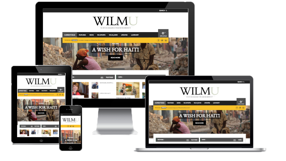
WilmU Magazine
After many years of using external consulting and hosting services (and lobbying from me), the university decided to bring the online design and publishing on the WilmU Magazine in-house. I set up a WordPress blog, network, customized a premium theme using CSS and JavaScript, and trained the staff on their new workflow
This project resulted in dramatically reducing costs and building skill within the magazine staff's department.
View Project